

About Course
Course Overview:
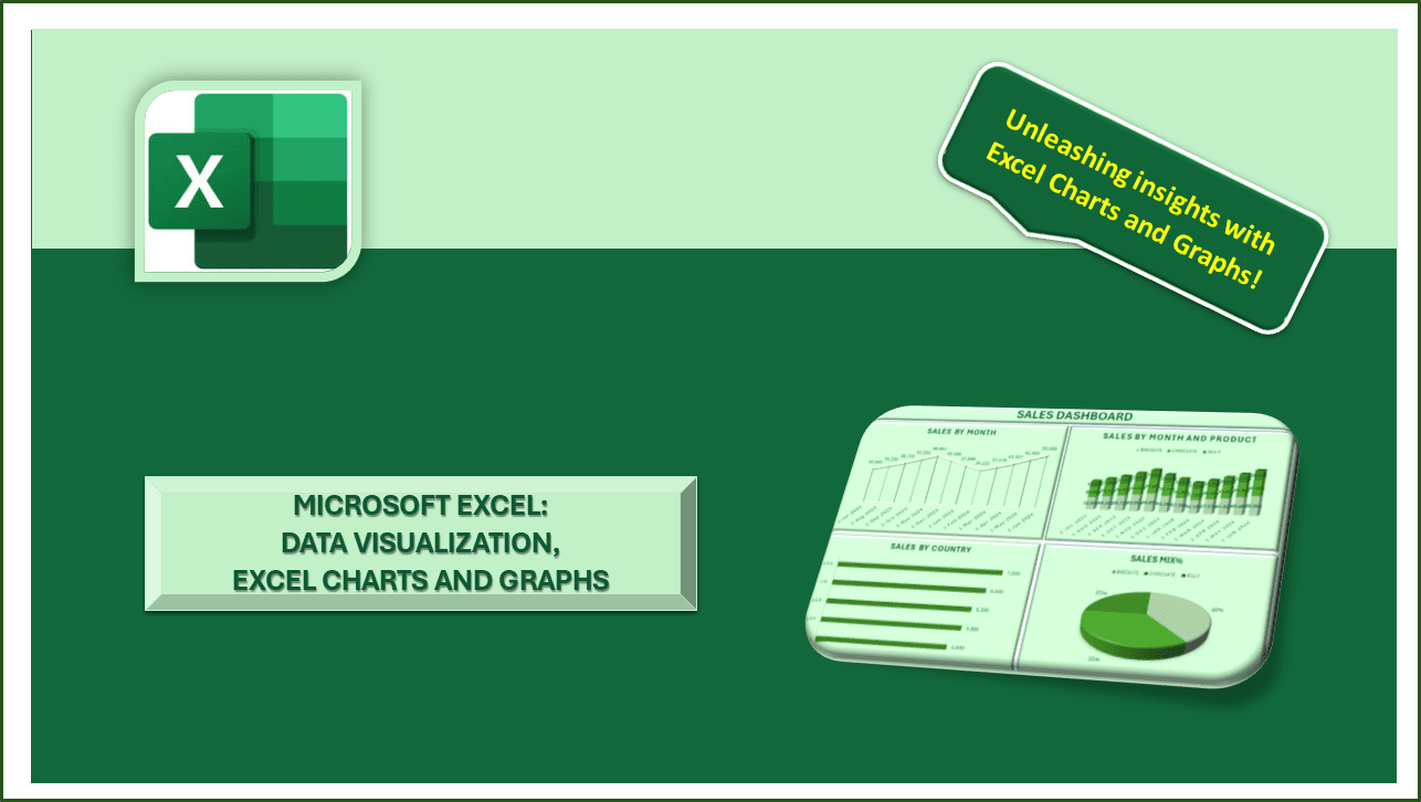
In this course, you will learn how to effectively visualize data using Excel’s powerful charting and graphing tools. From basic charts to advanced graphical representations, you’ll discover how to create visually appealing and insightful visuals that enhance your data analysis and presentation skills.
Frequently Asked Questions:
- Can I take this course if I’m new to Excel?
While some basic knowledge of Excel is recommended, this course is designed to cater to learners of all levels, including beginners. The lessons are structured to gradually introduce you to Excel’s charting and graphing tools, making it accessible even if you’re new to the software.
- Are there any specific versions of Excel required for this course?
This course covers Excel’s charting and graphing features available in various versions, including Excel 2010, Excel 2013, Excel 2016, Excel 2019, and Excel for Office 365. You can follow along with your preferred version of Excel.
- Will I receive a certificate upon completion of the course?
Yes, upon successfully completing the course and any associated assessments, you will receive a certificate of completion. This certificate can be a valuable addition to your resume or professional portfolio, showcasing your proficiency in data visualization with Excel.
- How much time should I dedicate to this course each week?
Dedicating 3-4 hours each week is recommended for optimal learning to watch the video lectures, complete the exercises, and practice creating charts and graphs in Excel. The more time you invest, the more proficient you’ll become.
- Can I access the course materials after completing the course?
Yes, once you enroll in the course, you’ll have 1 year access to the course materials, including video lectures, downloadable resources, and practice datasets. You can revisit the content at any time to refresh your knowledge or reinforce your skills.
- Do I need any special software or tools to follow along with the course?
All you need is a computer with Microsoft Excel installed. The course will guide you through the process of creating charts and graphs using Excel’s built-in features. No additional software or tools are required.
- Will I learn how to create interactive dashboards in Excel?
Yes, the course covers the creation of interactive dashboards using Excel’s charting and graphing tools. You’ll learn how to incorporate interactive elements such as slicers, timelines, and dynamic charts to create engaging and informative dashboards.
- Can I apply the skills learned in this course to my professional projects?
Absolutely! The techniques and best practices taught in this course are directly applicable to real-world data analysis and reporting tasks. Whether you’re creating reports for your organization or visualizing data for presentations, the skills you acquire will be invaluable in your professional endeavors.
- Is there a community or forum where I can interact with other learners?
Yes, we provide access to a dedicated online community where you can connect with fellow learners, ask questions, share insights, and collaborate on projects. It’s a supportive environment where you can learn from others and expand your network within the data analytics community.
- How can I get assistance if I encounter any difficulties during the course?
If you have any questions or encounter any challenges while taking the course, our support team is here to help. You can reach out to us via email or through the course platform, and we’ll promptly assist you with any issues or concerns you may have. Your success is our top priority!
Course Content
1. Introduction to Data Visualization in Excel
2. Exploring Basic Chart Types: Bar Charts, Column Charts, and Line Graphs
3. Creating Pie Charts and Doughnut Charts
4. Customizing Charts: Colors, Fonts, Labels, and Titles
5. Advanced Charting Techniques: Sparklines, Trendlines, and Error Bars
6. Combining Multiple Chart Types: Combo Charts and Dual-Axis Charts
7. Interactive Visualization with Slicers, Timelines, and Data Bars
8. Geographical Mapping and 3D Visualization in Excel
9. Designing Effective Dashboards with Dynamic Charts and Graphs
10. Tips and Tricks for Effective Data Storytelling
Student Ratings & Reviews
